The Ocearo brand.
How the Ocearo name, mark and colours are built, and how to use them. For articles, videos, partners and contributors.
Logo
The logo is the word OCEARO in which the O is the compass of the 3D view and the A is a bow splitting the horizon. Use the dark version on dark backgrounds and the light version on light ones.
 logo · dark backgrounds
 logo · light backgrounds
 compass mark
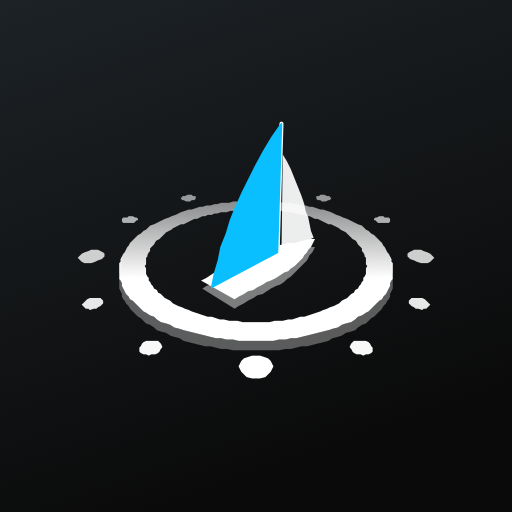 app icon
Construction
Every part of the logo comes from the app itself.
- The O is the compass of the 3D view, tilted 60° in perspective like the ring that floats around the boat, with its bezel, its twelve graduations fading towards the back and the own boat at its centre.
- The boat heads 045, towards the rest of the name: white jib, Ocearo-blue mainsail, standing in its centreline plane.
- The A is the bow: two blades meeting at the stem, the horizon line in Ocearo blue passing behind and cut where they touch.
- The letters are Geist Regular in capitals, tracked at 0.34 em, like the labels of the instrument panel (SOG, HEADING, TWS).
- Small sizes: at 48 px and below the compass is shown flat, face-on, with the two sails, so it stays sharp.
Clear space and sizes
Keep a clear space around the logo at least as wide as the letter C. Never place it closer to an edge or to other elements.
| Use | Minimum size | Version |
|---|---|---|
| Full logo, screen | 120 px wide | Logo, dark or light |
| Full logo, print | 30 mm wide | Logo, dark or light |
| App icon | 64 px | Tilted compass on black tile |
| Favicon | 16 px | Flat compass with sails |
Colours
A near-black ground and one luminous blue. Red, green, violet and yellow are reserved for meaning — danger, starboard, their move, caution — and never used for decoration.
#09BFFF · oBlueBrand accent, own boat, actions#0A0A0A · backgroundMain background#FFFFFF · foregroundText and logo on dark#0D1114 · inkLogo and text on light#0090C8 · blue-deepAccent on light backgrounds#CC000C · oRedDanger, our move, MOB#0FCD4F · oGreenOK, starboard, course#FFBE00 · oYellowWarnings#424242 · oGray2Panels and bordersTypography
Geist, by Vercel, under the SIL Open Font Licence. One family for everything; Geist Mono for coordinates and data.
Interface principles
The look of the app and of everything around it.
- Calm first. A dark, quiet screen; only what needs attention lights up.
- One accent. Ocearo blue marks the own boat and the actions. Everything else is white or grey.
- Colour means something. Red, violet, orange and green follow the COLREG and navigation-light conventions, everywhere.
- Numbers you read from afar. Large values, small spaced labels, tabular figures.
- Real pictures only. Screenshots and videos come from the app with real data, never mock-ups or stock photos.
Do and don’t
The logo is always used as supplied.
Voice
Ocearo speaks like a good crew member: short, factual, calm. Sailing words, not software words.
| Say | Avoid |
|---|---|
| Avoid: 15° to port. Rule 18, we keep clear. | Collision algorithm output |
| An aid to the watch. | Fully autonomous navigation |
| Anchor watch, man overboard, laylines. | Geofence, emergency module, routing engine |
| Works offline once the area is downloaded. | Cloud-powered |